

How to use my AoE2 Reports
Some time ago, I started tracking my own game data with the idea to create a report, analyzing my progress – or lack thereof – in Excel. Soon I got curious about other things related to the AoE2 community, such as viewer behavior, number of players, the ladder, etc.
So my reports grew. Eventually, I shared some of my charts and received encouraging feedback. I got hooked and kept building. Once I started, I realized that Excel is a great tool to do such number games, but not so well suited to sharing charts, especially charts, which could be updated automatically and allow people to interact with them. So I decided to migrate the whole project to PowerBI.
While this comes with many advantages, there is also a bit of a learning curve. So I prepared a short introduction for you to enjoy all the benefits. If you are familiar with PowerBI, feel free to jump into the report right away. To get a full-screen view, just click the double-arrow icon ![]() in the bottom right-hand corner.
in the bottom right-hand corner.
Otherwise, keep reading or watch the video at the end of the page for some guidance.
Note: The video is really just an explainer on how to use the reports. It is NOT necessary to watch and does NOT provide any analysis of the data.
The Report
You will see that we start on the ‘Comm.’ (for Community) page. I think this is the most useful one for answering the question about the community’s growth. You can see how the Twitch ‘hours watched’ and ‘concurrent viewers’ numbers evolved. I also added some Steam numbers about the average concurrent players – here, I really like the ‘monthly’ view and find it quite interesting – check it out.
The Basics
The whole report has four pages:
- Me
This is probably the least interesting one for anybody except myself. But it is how it started, so there you go. - Ladder
Here I look at the top 1000 players, their game statistics, and a few less common things such as distribution across the world. All the data is coming from aoe2.net. - Events
This page shows information about events (tournaments and showmatches). You can see how many events happened when, what the related prize pools were and how they evolved. As a bonus, there is also a list of the top 10 players based on prize money won.
All this data is coming from esportsearnings.com.

4. Comm. (for Community)
This is all about the community in terms of viewers, hours watched, number of players, etc. The data for this is coming from twitchtracker.com and steamcharts.com.
How to use
Apart from the main navigation, you will find several elements on each page:
- Visuals
These are all kinds of visualization, such as charts, tables, or maps. - Filters
You can use filters to refine the data displayed in visuals. Filters can affect the time range or data types. - Buttons
On some charts, there are additional buttons. These allow you to switch the chart from one view to another. E.g., from ‘Hours Watched’ to ‘Concurrent Viewers’ on Twitch. - Additional information
Whenever you hover with your mouse over a data point, a small pop-up will show you additional information about it.
Note that the visuals on a page interact with each other. I.e., if you click on a data-point in one visual (e.g., the year ‘2019’), the data in the other visuals will be cross-filtered and only show data points from 2019. It sounds complicated, but it is super simple and really useful. You can do multi-selections by holding the CTRL key while clicking. After playing around for a bit, you will surely get the hang of it.
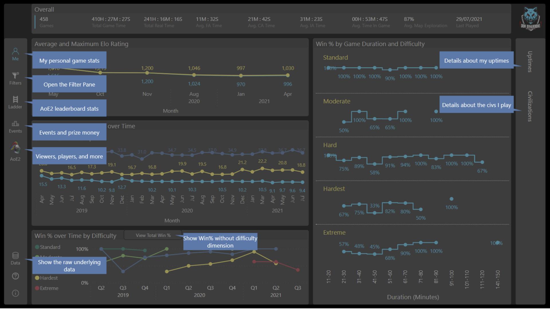
Here are a few screenshots to illustrate this – just click them for a larger view.


If you prefer watching an introduction video over reading the text below, check out the video below.
Pingback: Is the AoE2 community really growing? – Don Dinardoni – Age of Empires II World Series
Ingmar
Your reports look amazing. I’m a beginner power bi user myself and quite curious how you achieved some things like the numberless heat map, discrete line chart jumps (the boxcar basically) and such. Would be great if you have some time to give me tips.
Don Dinardoni
Hi. Happy to help. Let me try:
1. The heat maps are not really numberless. I use conditional formatting for the background and the SAME rules and colors for the numbers. So, while the numbers are there, they are just not visible.
2. You can do the ‘discrete line chart jumps’ by formatting the visual. Set ‘stroke width’ to 0, show marker. Could look like this: https://bit.ly/3r9BhMv
I hope this helps – let me know if you have any further questions.